Pride
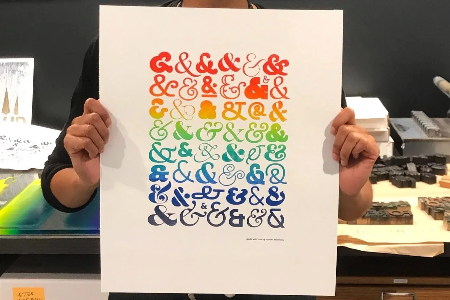
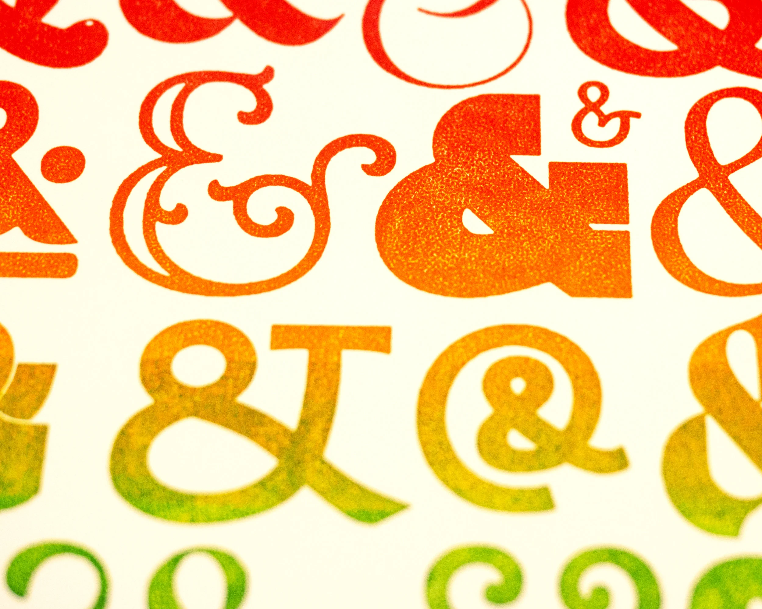
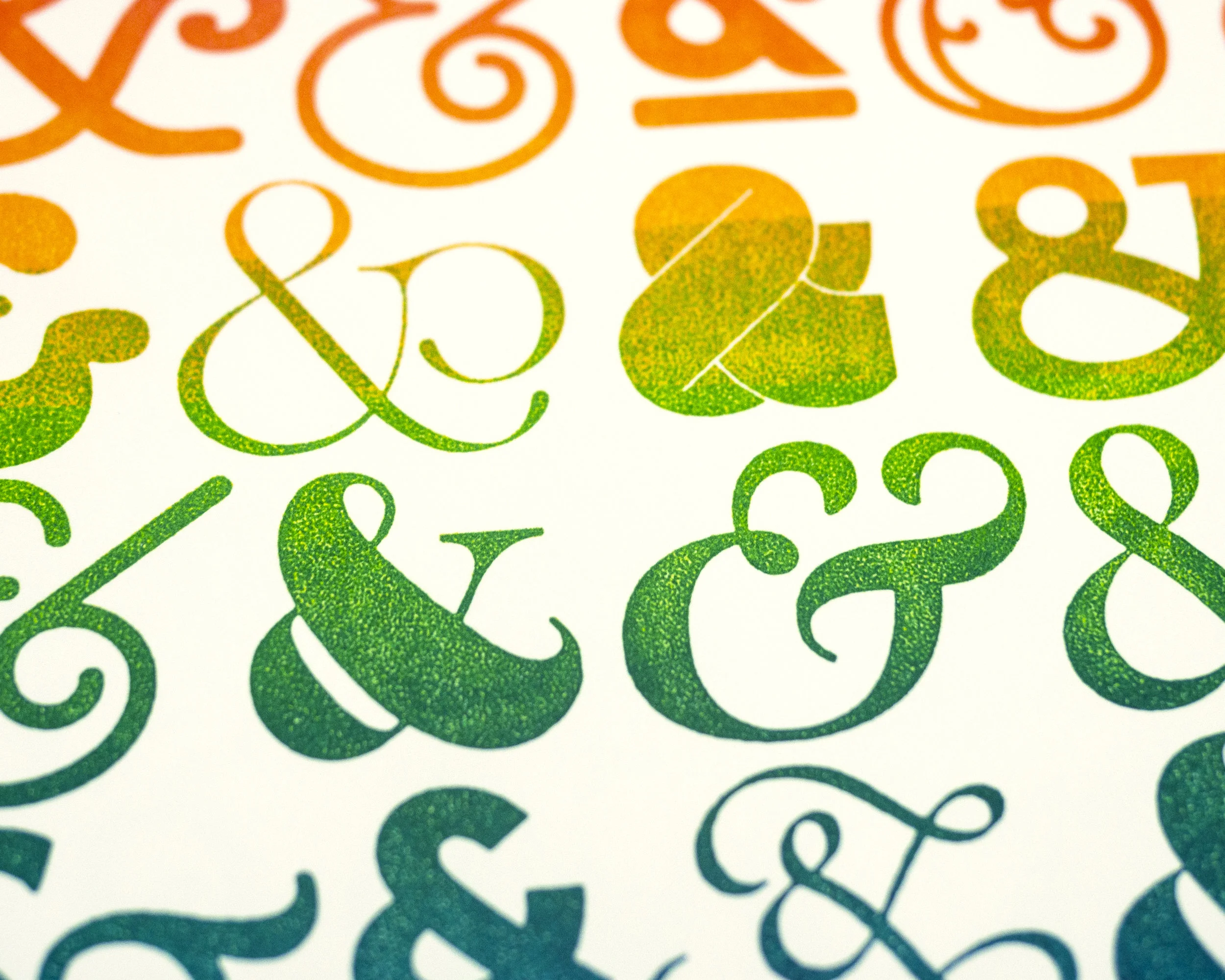
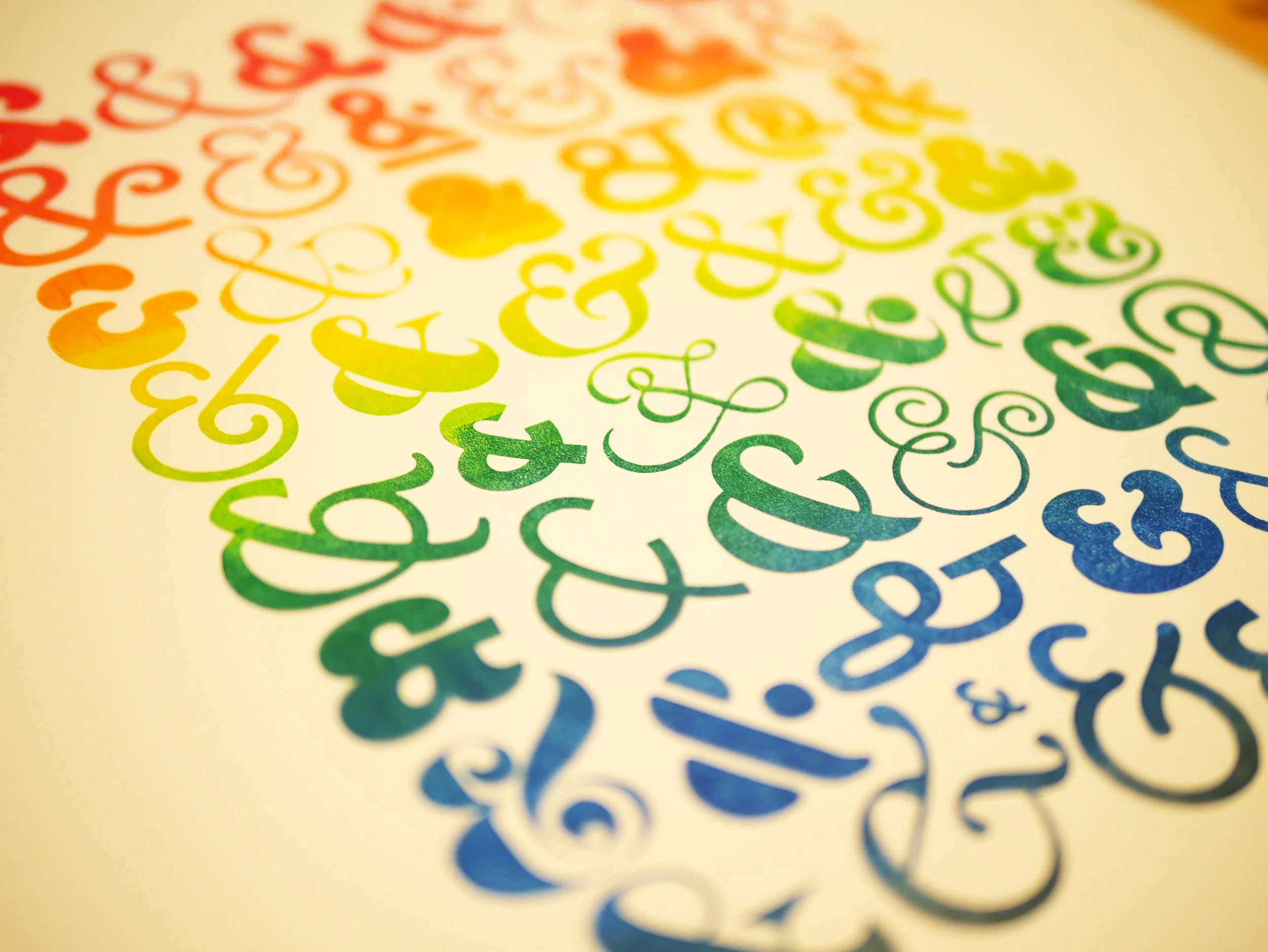
Ampersands are interesting characters. They’re not letters. They’re not numbers. They stand for a word, an idea that unifies. They’re also extremely diverse in their look.
This poster celebrating Pride was printed by the illustrious Jessixa Bagley on the Vendercook letterpress at Hornall Anderson. Jessixa hand-inked the split fountain posters, which made each imprint unique, like the nuances between people. I love that.
The posters were given away for free during Pride week at Seattle’s three Cone & Steiner store locations as an artful gesture of diversity’s beauty.
Concept and design in partnership with the team at Hornall Anderson.